

Property controls
A custom property control is defined using the following syntax, starting with 3 mandatory keywords:
Mandatory keywords
propertyName
(string) - required; used to display label in the Properties Panes for a property.
propertyKeyword
(string) - required; used in the main code as a keyword; no whitespaces are allowed.
propertyType
(string) - required; defines the type of control used in the Properties Pane, with the allowed values below:
1. simple text: text
2. text area (pop-up text): details with template = textarea
3. dropdown selection (unique): select
4. dropdown selection (multiple):
5. numeric: numeric
6. checkbox (boolean): checkbox
7. properties group: group
8. properties block: block
9. field list: fieldList
10. field list with dropdown of attributes: fieldList with template = orderedList
11. select from a list of entities
The rest of the keywords below are optional.
Syntax
Below is the list of optional keywords.
abbr
(string) - optional: short marker drawn on the attribute in the ERD, e.g. PK
addTimestampButton
(boolean) - optional (default = false): if "propertyType": "details" and "template": "textarea", a button "Add timestamp" can be made to appear
allowNegative
(boolean) - optional (default = true): for numeric controls only. Self explanatory. If false, equivalent to setting minValue to 0.
attributeList
(array of values) - optional) : used in combination with propertyType = fieldList and template = orderedList
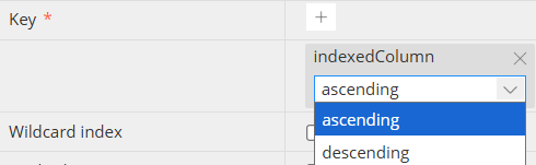
{
"propertyName": "Key",
"propertyKeyword": "indxKey",
"propertyType": "fieldList",
"template": "orderedList",
"attributeList": ["ascending", "descending"],
"requiredProperty": true
}
cleanDependency
(boolean) - optional (default = false) - deprecated from v7.6.1: used to reset related properties to their default values when the user chooses a different option. When the related property doesn’t have default value, it will not be changed. When there are few configurations for the same *propertyKeyword*, the property will not be changed as well.
customScriptVariables
(boolean) - optional (default = false): used in template = codeEditor, allows to use predefined variables, to be resolved automatically during script generation, as described here.
defaultValue
(string/number/boolean) - optional; default value for property
dependency
(object) - optional: contains an object with a key and arguments determining whether or not to display this property.
Example of a simple dependency, testing the value of a property:
"dependency": {
"key": "type",
"value": "string"
}
Example of a dependency, testing for the presence of a property:
"dependency": {
"key": "name",
"exist": false
}
Example of a dependency, testing for the properties of the string characteristics of a property:
"dependency": {
"key": "name",
"minLength": 5,
"maxLength": 10
}
Example of a dependency, testing for the properties of the regex pattern value of a property:
"dependency": {
"key": "name",
"pattern": "^(H|h)ackolade (2.5.8|3.0.2)$"
}
Example of a dependency, testing for multiple values of a property (equivalent to an or operator):
"dependency": {
"key": "mode",
"value": ["char" ,"varchar", "bit", "varbit"]
}
Example of a dependency, testing for the properties of the numeric value of a property:
"dependency": {
"key": "amount",
"minimum": 10,
"exclusiveMinimum": true,
"maximum": 100
}
Example of a dependency combining and and or operators:
"dependency": {
"type": "and",
"values": [
{
"type": "or",
"values": [
{
"level": "parent",
"key": "name",
"value": "query"
},
{
"level": "parent",
"key": "name",
"value": "formData"
}
]
},
{
"level": "parent",
"key": "structureType",
"value": true
}
]
}
As you can see above, you can use for your dependency a keyword located at a different level. To avoid any risk of confusion if you use the same keyword at different levels, it is recommended to use the dot notation based on the root level.
{
"propertyName": "Enabled",
"propertyKeyword": "configEnabled",
"propertyType": "checkbox",
"dependency": {
"level": "objectRoot",
"key": "dbtLabs.semanticComponent",
"value": "metric"
}
},
When a dependency contains a key pointing to a multipleCheckboxSelect control (dropdown with multiple select), then the key must be appended with dot+star (".*") to indicate "any element in the array".
"structure": [
{
"propertyName": "Data Classification",
"propertyKeyword": "dataClassification",
"propertyType": "multipleCheckboxSelect",
"options": [
"PII",
"GDPR",
"Confidential",
"Public"
]
},
{
"propertyName": "Shows when PII is included",
"propertyKeyword": "showsWhenPII",
"propertyType": "text",
"dependency": {
"key": "dataClassification.*",
"value": "PII"
}
},
{
"propertyName": "Shows when PII or GDPR",
"propertyKeyword": "showsWhenPIIorGDPR",
"propertyType": "text",
"dependency": {
"key": "dataClassification.*",
"value": [
"PII",
"GDPR"
]
}
},
{
"propertyName": "Shows when Confidential is NOT selected",
"propertyKeyword": "showsWhenNotConfidential",
"propertyType": "text",
"dependency": {
"type": "not",
"values": [
{
"key": "dataClassification.*",
"value": "Confidential"
}
]
}
},
{
"propertyName": "Shows when PII and GDPR",
"propertyKeyword": "showsWhenPIIandGDPR",
"propertyType": "text",
"dependency": {
"type": "and",
"values": [
{
"key": "dataClassification.*",
"value": "PII"
},
{
"key": "dataClassification.*",
"value": "GDPR"
}
]
}
}
]
disabledOption
(boolean) - optional (default = false): only applicable to "propertyKeyword": "dropdownProp" if the dropdown list must appear in grey and disabled.
disabledOnCondition
(object) - optional: disables the property if any of conditions is true for the current entity. Must be an array of condition objects. The condition object can have the following structure:
{
"propertyName": "Or replace",
"propertyKeyword": "orReplace",
"propertyType": "checkbox",
"disabledOnCondition": {
"key": "ifNotExist",
"value": true
}
}
disableForDefinitions
(boolean) - optional (default = false): keeps the control active inside references of a reusable definitions
editorDialect
(string) - optional: used in template = codeEditor, editorDialect is one of the possible temptlateOptions and allows for syntax highlighting depending on the language: sql, pgsql, markdown, javascript, yaml.
enableForReference
(boolean) - optional: by default, properties of references to a definition (local, model or external) are typically disabled. By setting this to true, the property can be editable in the reference and its value has higher priority than the same property value from the referenced definition. So, when the reference is resolved, the properties values will be taken from the reference (if present) and not from its definition.
excludeCurrent
(boolean) - optionsl (default = false): in case of selectHashed list, excludes the current object from the list
helpUrl
(string with URL) - optional: allows to display a question mark ("?") icon next to the property label, pointing the a web page containing instructions.
inputPlaceholder
(string) - optional: displays a greyed out hint in text background
groupItemLimit
(numeric) - optional: inside a propertyType = group, it is possible to maximum number of groups
hidden
(boolean) - optional (default = false): hides the control from the pane while keeping the value.
labelName
(string) - optional: display an alternate label for the propertyName
markdown
(boolean) - optional (default = true): if "propertyType": "details" and "template": "textarea", markdown can be turned off (for example for functions)
maxValue
(number) - optional: for numeric controls only. Self explanatory
minValue
(number) - optional: for numeric controls only. Self explanatory
options
(array) - optional: used to define possible values in the the list to choose from, if propertyType is select.
propertySource
(object) - optional: used with propertyType = selecthashed if you need to specify the source at a different object level than the current.
{
"propertyName": "Tag name",
"propertyKeyword": "tagName",
"propertyTooltip": "Specify tag to be referenced at all levels",
"propertyType": "selecthashed",
"withEmptyOption": true,
"propertySource": {
"level": "container",
"source": "tags.*.name"
}
}
propertyTooltip
(string) - optional: only taken into account for propertyTypes: text area, dropdown, properties group, and field list
regex
(string) - optional: defines the regex validation for this specific property (the same propertyName could have a different validation rule elsewhere.)
requiredProperty
(boolean) - optional (default = false): adds an asterisk next to the property name in the Properties Pane.
shouldValidate
(boolean) - optional (default = false): defines whether field should be validated or any value is allowed. Validation rules are defined once in validationRegularExpressions.json, and are the same in any matching propertyName in any level.
step
(numeric) - optional (default = 1): for a numeric propeety typically defined between a nimValue and a maxValue, the step increment that the up/down arrows allow.
{
"propertyName": "Numeric",
"propertyKeyword": "numericProp",
"propertyType": "numeric",
"valueType": "number",
"allowNegative": false,
"minValue": 0,
"maxValue": 1,
"step": 0.01,
"propertyValidate": true
}
template
(string) - optional; template used in the modal window if propertyType is details; possible value is:
- details: textarea, or textAreaJSON (input is validated to be JSON)
- fieldList: orderedList
- code editor
- collectionTree
- entities
- boolean
- definitions
templateOptions
(object) - optional: allows to specify the behavior of the template
{
"propertyName": "Before CREATE VIEW",
"propertyKeyword": "beforeCreateView",
"propertyType": "details",
"markdown": false,
"template": "codeEditor",
"templateOptions": {
"editorDialect": "sql",
"customScriptVariables": true
}
}
typeDecorator
(boolean) - optional (default = true): if false, turns off the display of length in parenthesis in ERD, e.g. for varchar data type instead of varchar(4000).
validation
(object) - optional: adds a warning badge in case no value is in the property, with a tooltip message:
"requiredProperty": true,
"validation": {
"required": true,
"message": "Required property"
}
valueType
(string) - optional; type (one out of 7 basic types) to define validation rules.
withEmptyOption
(boolean) - optional (default = false): used in propertyType = selectHashed to determine whether the dropdown list should include an empty option or just the strict list of possible choices.
Input controls
For your properties, you may choose among a number of input controls:
Simple text
Display a box for short free-form text input

One may find useful to add keywords such as propertyTooltip, valueType, inputPlaceHolder, and defaultValue.
{
"propertyName": "Simple text",
"propertyKeyword": "simpletextProp",
"propertyType": "text",
"valueType": "string"
}
Text area (pop-up box)
For longer, more elaborate text, possibly including URL hyperlinks and markdown, this control allows users to click the ellipse (3 dots) in the properties pane to pop a box up.

One may find useful to add keywords such as markdown (set to true), or addTimeStampButton
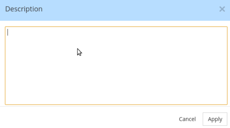
{
"propertyName": "Text area",
"propertyKeyword": "textareaProp",
"propertyTooltip": "Popup for multi-line text entry",
"propertyType": "details",
"template": "textarea",
"markdown": false
}
Dropdown list selection (unique)
Display a list of allowed values whereby only a single value is possible. If the choice is optional, make sure to include an empty "" option, generally at the top of the list. You may define a defaultValue. It is also easy to build a dependency on the value selected in another property.
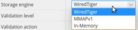
{
"propertyName": "Dropdown selection",
"propertyKeyword": "dropdownProp",
"shouldValidate": false,
"propertyTooltip": "Select from list of options",
"propertyType": "select",
"options": [
"Option 1",
"Option 2",
"Option 3",
"Option 4"
]
}
Dropdown list selection (multiple)
Display a list of allowed values whereby 0 to multiple values are allowed.
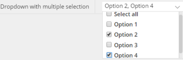
{
"propertyName": "Dropdown with multiple selection",
"propertyKeyword": "dropdownMulti",
"propertyTooltip": "Select from list of options",
"propertyType": "multipleCheckboxSelect",
"options": [
"Option 1",
"Option 2",
"Option 3",
"Option 4"
]
}
numeric
Display a box that only allows numeric values. Up and down arrows allow to increase or decrease the value according to a defined step (if different than 1).

{
"propertyName": "Numeric",
"propertyKeyword": "numericProp",
"propertyType": "numeric",
"valueType": "number",
"allowNegative": false,
"minValue": 0,
"maxValue": 1,
"step": 0.01,
"propertyValidate": true
}
checkbox (boolean)
Displays a checkbox for boolean values true/false.

{
"propertyName": "Checkbox",
"propertyKeyword": "checkboxProp",
"propertyType": "checkbox"
}
properties group
Displays a complex structure of one or more properties, whereby multiple groups can be created. To create the group, the user clicks on the + plus sign. The user may delete a previously created group by clicking the X.
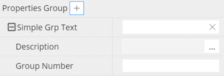
{
"propertyName": "Group",
"propertyType": "group",
"propertyKeyword": "grpProp",
"propertyTooltip": "",
"structure": [
{
"propertyName": "Simple Grp Text",
"propertyKeyword": "simpleGrpText",
"propertyType": "text"
},
{
"propertyName": "Group Number",
"propertyKeyword": "grpNumber",
"propertyValidate": true,
"propertyType": "numeric",
"valueType": "number",
"allowNegative": false
}
]
}
properties block
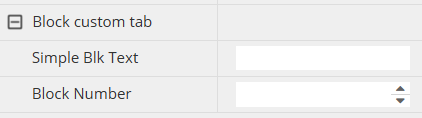
A block control is similar to a group control except for the fact that there can only be 0 or 1 block entry, whereas groups allows between 0 and multiple entries.
field list
This control allows to select items from a dialog of allowed items (for example columns of an entity that can be part of a composite primary key). the items can be ordered, either through the sequence used during selection, or later on with the up/down arrow buttons.
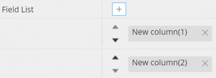
{
"propertyName": "Field List",
"propertyKeyword": "keyList",
"propertyType": "fieldList",
"template": "orderedList"
}
field list with dropdown of attributes
Optionally, it may be useful to qualify the items in a field list with different possible attributes.
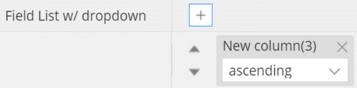
{
"propertyName": "Field List w/ dropdown",
"propertyKeyword": "keyListOrder",
"propertyType": "fieldList",
"template": "orderedList",
"types": [
"ascending",
"descending"
]
}
select from a list of entities
This control allows to list entities of another object level to select from.
{
"propertyName": "Tag name",
"propertyKeyword": "tagName",
"propertyTooltip": "",
"propertyType": "selecthashed",
"withEmptyOption": true,
"propertySource": {
"level": "container",
"source": "tags.*.name"
}
}
see keywords withEmptyOption, and propertySource